


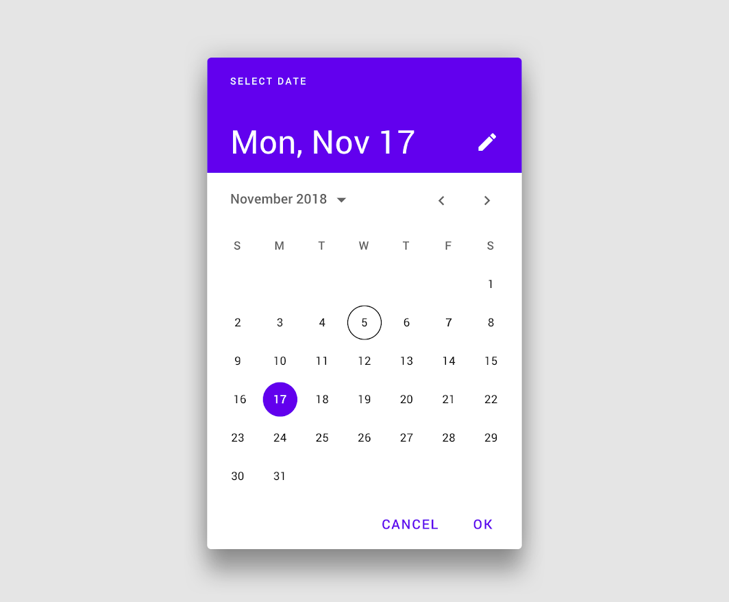
Android has a built-in date picker called Material Date Picker. It is one of the UI components provided by the Material Components for Android library. In this article, I will guide you through the creation of the Material Date Picker. Below is the visual representation of the Material Date Picker.
Step 1
Open your Android project. You then need to initialize MaterialDatePicker class. To do that add the code below.
val datePicker = MaterialDatePicker.Builder.datePicker().build()
The Builder class is responsible for creating and configuring instances of the MaterialDatePicker class. Using the builder pattern, you can chain method calls to set various options and parameters for the MaterialDatePicker instance. In this case, the datePicker() and build() methods are chained together to create the MaterialDatePicker object with the desired configurations.
Step 2
Once you have initialized the MaterialDatePicker, it is time to display it. Add the following code to the desired location in your application where you want to show the MaterialDatePicker.
datePicker.show(supportFragmentManager, "you_can_give_any_name")
The show method takes in two arguments. The first one is a FragmentManager and the second is a String . If you are in an Activity then you can use supportFragmentManager and if you are in a Fragment then you can use ParentFragmentManager or childFragmentManager.
Step 3
When selecting a date, you would typically want something to happen. MaterialDatePicker provides four different listeners to handle these events.
- addOnPositiveButtonClickListener
datePicker.addOnPositiveButtonClickListener {
  // called when you press okay button
}
- addOnCancelListener
datePicker.addOnCancelListener {
   // called when you press back button and anything you click outside of the calendar
}
- addOnDismissListener
datePicker.addOnDismissListener {
    // called when calendar is dismissed, no matter how it is dismissed
}
- addOnNegativeButtonClickListener
datePicker.addOnNegativeButtonClickListener {
    // called when cancel button is pressed
}
Important: your app may crash
Go to styles.xml or themes.xml which you can find it in res -> values -> themes . Here you must specify the theme as Theme.MaterialComponents as the parent theme for your app. If you don't do this then the app will crash.
If your app doesn't use Theme.MaterialComponents as the parent theme, then you can create a custom theme and set that theme to ThemeOverlay.MaterialComponents.MaterialCalendar.
<style name="custom_theme" parent="ThemeOverlay.MaterialComponents.MaterialCalendar">

<item name="colorPrimary">@color/red</item>
<item name="colorOnPrimary">@color/white</item>
<item name="colorSecondary">@color/blue</item>
<item name="colorSurface">@color/my_app_background</item>
<item name="colorOnSurface">@color/my_app_error</item>

<!-- these properties should be listed here, without these the app will crash, MaterialDatePicker needs these properties -->
<item name="android:textColorPrimary">@color/red</item>
<item name="android:colorControlActivated">@color/blue</item>
<item name="colorPrimaryVariant">@color/grey</item>
<item name="colorOnSecondary">@color/white</item>
<item name="colorOnBackground">@color/rose</item>
<item name="colorOnError">@color/orange</item>
<item name="scrimBackground">@color/purple</item>

<item name="textAppearanceDisplayLarge">@style/TextAppearance.Material3.DisplayLarge</item>
<item name="textAppearanceDisplayMedium">@style/TextAppearance.Material3.DisplayMedium</item>
<item name="textAppearanceDisplaySmall">@style/TextAppearance.Material3.DisplaySmall</item>
<item name="textAppearanceHeadlineLarge">@style/TextAppearance.Material3.HeadlineLarge</item>
<item name="textAppearanceHeadlineMedium">@style/TextAppearance.Material3.HeadlineMedium</item>
<item name="textAppearanceHeadlineSmall">@style/TextAppearance.Material3.HeadlineSmall</item>
<item name="textAppearanceTitleLarge">@style/TextAppearance.Material3.TitleLarge</item>
  <item name="textAppearanceTitleMedium">@style/TextAppearance.Material3.TitleMedium</item>
<item name="textAppearanceTitleSmall">@style/TextAppearance.Material3.TitleSmall</item>
<item name="textAppearanceBodyLarge">@style/TextAppearance.Material3.BodyLarge</item>
<item name="textAppearanceBodyMedium">@style/TextAppearance.Material3.BodyMedium</item>
<item name="textAppearanceBodySmall">@style/TextAppearance.Material3.BodySmall</item>
<item name="textAppearanceLabelLarge">@style/TextAppearance.Material3.LabelLarge</item>
<item name="textAppearanceLabelMedium">@style/TextAppearance.Material3.LabelMedium</item>
<item name="textAppearanceLabelSmall">@style/TextAppearance.Material3.LabelSmall</item>
<item name="shapeAppearanceSmallComponent">@style/ShapeAppearance.Material3.SmallComponent</item>
<item name="shapeAppearanceMediumComponent">@style/ShapeAppearance.Material3.MediumComponent</item>
<item name="shapeAppearanceLargeComponent">@style/ShapeAppearance.Material3.LargeComponent</item>
</style>
To add this theme to your MaterialDatePicker , add the following code.
  val datePicker = MaterialDatePicker.Builder
            .datePicker()
            .setTheme(R.style.custom_theme)
            .build()
Conclusion
The MaterialDatePicker is a powerful tool provided by the Material Components for Android library. It is easy to implement and provides customizable options and offers a seamless and visually appealing date selection experience for Android developers and users.
Feel free to leave comments and feedback.
Happy coding.